

It's time to go on a feel trip with React. Let us pack our bags and start our journey towards learning React from scratch with techs those we have today. In this article we will start our React learning journey by setting up the project with Vite and most desirable UI framework Bootstrap.
We have to travel a mile to reach the top of the React mountain. For this have to be prepared with our travel gears and tools. Without further ado we will began with our journey path and head towards the ultimate goal.
We will start with understanding the basics of what, why, and when of React and then head towards the how part. Along with our exploration we will build an application (Notesy) side by side to support our understanding of concepts and understand something from functional perspective rather than theoretical verbose.
We will head in this direction:
Let us get started!
In today's era of web techs, one at least heard about the super awesome UI library called React. If not already, then it's our duty to explain what React is.
React is a JavaScript library to develop web apps, mainly provides the reusability of UI elements and components across your app that helps to achieve easier maintainability, reusability and testability along with reduction in overall development efforts. It works on a concept called Virtual DOM instead of your main DOM. This helps to have faster change detection mechanism of UI states. For further read checkout React Official Website.
So, before you start your React journey you must be equipped with below arsenal:
Back in the old days, to create react app we used create-react-app (funny). The CRA been a smart tool until a wise tool arrived; Vite. The Vite is revolutionary tool to create and build your JS or JS Framework/Library apps with a lighting fast speed. Checkout about Vite from Vite's official website and also, check out this CodeOmelet's video about Vite for TypeScript.
Enough bragging about Vite, let us setup our React app (Notesy) using Vite.
Take a fresh working directory to setup your project and run below command:
npm create vite@latestThis will ask some questions, provide below options:
# project name: notesy-app
# framework: react
# variant: JavaScript + SWC
For variant you can choose JavaScript or JavaScript + SWC, both will work in our case.
Once options are provided, your project will be created, but without "node_modules" folder run below commands those mentioned by Vite itself:
cd notesy-app
npm i
npm run dev
Your project structure will look something like this:
notesy-app
|-- public
|   |-- vite.svg
|-- src
|   |-- assets
|   |-- App.css
|   |-- App.jsx
|   |-- index.css
|   |-- main.jsx
|-- .eslintrc.cjs
|-- index.html
|-- package.json
|-- README.md
|-- vite.config.jsLet us clear the initial boiler plate code and make our app empty. Delete the App.css file and remove everything from App.jsx, imports and HTML code. Just add one h1 tag with "Hello World" written inside it.
function App() {
  return (
    <>
      <h1>Hello World</h1>
    </>
  );
}

export default App;
Now, if you run your app using "npm run dev" command you only able to see "Hello World" printed on the screen.
We will add Bootstrap for UI capabilities and Bootswatch theme on top of Bootstrap just to keep it funky. We will also use React Icons for keeping our app rich in UX. For this add below dependencies:
npm i bootstrap
npm i bootswatch
npm i react-icons
For setting up Bootstrap and use Bootswatch theme, go to "index.css" file and add below line:
@import 'bootswatch/dist/litera/bootstrap.min.css';Now, go to "main.jsx" file and add Bootstrap bundled JS file:
...
import 'bootstrap/dist/js/bootstrap.bundle.js';

ReactDOM.createRoot(document.getElementById('root')).render(
  <React.StrictMode>
    <App />
  </React.StrictMode>
);Let us open the "App.jsx" file and start painting our imaginations. Right now, our "App.jsx" looks like this:
function App() {
  return (
    <>
      <h1>Hello World</h1>
    </>
  );
}

export default App;
Will add the base of Bootstrap, that is container:
function App() {
  return (
    <>
      <div className="container my-5">
        <div className="row">
          <div className="col">
            <h1>Hello World</h1>
          </div>
        </div>
      </div>
    </>
  );
}

export default App;
Adding now the header and footer component. Create a folder called "components" in which will have Header.jsx and Footer.jsx.
Starting with "Header.jsx" first:
import { FaFeather } from 'react-icons/fa';

const Header = () => {
  return (
    <>
      <h1 className="text-center mt-5 display-1 fw-bolder text-dark-emphasis">
        <FaFeather size={'3rem'} className='text-success' /> notesy
      </h1>
    </>
  );
};

export default Header;
Then, "Footer.jsx" component:
const Footer = () => {
return <div className='text-center p-5 bg-light'>
All rights reserved © {(new Date()).getFullYear()}
</div>;
};
export default Footer;
Here, in the Header.jsx component we are adding a FontAwesome icon of feather, you can read more about icons from the official React Icons website.
Now, let us add it to App.jsx:
import Footer from './components/Footer';
import Header from './components/Header';

function App() {
  return (
    <>
      <Header />

      <div className="container my-5">
        <div className="row">
          <div className="col">
            <h1>Hello World</h1>
          </div>
        </div>
      </div>

      <Footer />
    </>
  );
}

export default App;
A data file will be needed to show a list of already created notes and provide our data structure to our app which serves the basis for any project:
export const notes = [
  {
    id: '67b15a30-df51-4e0f-8cc3-b061bdcc12ee',
    note: 'Consectetur labore est amet aute pariatur enim in sint pariatur ipsum culpa.',
  },
  {
    id: '4496fcdc-e3fe-46e1-9c58-e8f83ef1f587',
    note: 'Et occaecat amet duis anim.',
  },
  {
    id: 'cc2826d0-6939-42a1-a8aa-3639cb38eb5a',
    note: 'Voluptate voluptate cupidatat ut eiusmod Lorem consequat commodo.',
  },
];
Here, our individual note will have id and note. The id will always be unique and follow the UUID ideology.
Create a form for entering new note, this form will be dead simple, with only input text field and an add button.
import { FaPlus } from 'react-icons/fa';

const Form = () => {
  return (
    <>
      <form>
        <div className="input-group mb-4">
          <input
            type="text"
            className="form-control"
            placeholder="Write some notes..."
          />
          <button className="btn btn-success" type="submit">
            <FaPlus />
          </button>
        </div>
      </form>
    </>
  );
};

export default Form;
Here, we have created HTML form with input and a button.
Create an empty component now with beautiful message to convey that there are not notes present to show.
import { FaDove } from 'react-icons/fa';

const Empty = () => {
  return (
    <>
      {false && (
        <div className="text-center p-3 text-muted">
          <h1 className="display-4 text-secondary">
            <FaDove className="me-2" />
          </h1>
          No notes found
        </div>
      )}
    </>
  );
};

export default Empty;
Here, notice that we have kept a false before the UI div, this is because the empty message will displayed in case if there are not notes present. So, for now if you want to see visually how it is appearing just make it true instead of false.
Add these components to App.jsx as shown below:
import Footer from './components/Footer';
import Form from './components/Form';
import Header from './components/Header';
import Empty from './components/Empty';

function App() {
  return (
    <>
      <Header />

      <div className="container my-5">
        <div className="row">
          <div className="col">
            <Form />
            <Empty />
          </div>
        </div>
      </div>

      <Footer />
    </>
  );
}

export default App;
Before we jump to design our list component to show a list of cards for individual note, it's important to create an item component that shows a note in a card format.
import { FaTrash } from 'react-icons/fa';

const Item = () => {
  return (
    <>
      <div className="card bg-body-secondary border-0 mb-2">
        <div className="card-body">
          <p className="card-text">
            <span className="d-flex justify-content-between align-items-center">
              <span>New Note</span>
              <button
                type="button"
                className="btn btn-light ms-3">
                <FaTrash size={'1rem'} className="text-danger" />
              </button>
            </span>
          </p>
        </div>
      </div>
    </>
  );
};

export default Item;
Here, we have a span for showing the content of note which we are showing "New Note" as of now. But in real scenario we will be needing the note object from the List component. So, will understand a concept of React here, that we need to pass a prop state from the List component to Item component. We can take out the prop state from the Item's parameter try (using JS concept of object destructuring).
const Item = ({ note }) => {
  ...
};
Sweet, now if you have ESLint extension installed in your VS Code then it will give you some warning that note is not has a prop validation. To get rid of this warning you need to mention what type of prop states Item component will receive form outside world:
...
import PropTypes from 'prop-types';

const Item = ({ note }) => {
  ...
  <span>{note.note}</span>
  ...
};

export default Item;

Item.propTypes = {
  note: PropTypes.object,
};
The PropTypes contains different types of datatypes, these are object, array, func, element etc. Here, we have note prop which is of type note. So, in the HTML span we are using now note.note to represent the note content.
Finally, let us build the parent List component which will have an array of notes and these notes will be looped to show the note content using Item component. Let us see what we are talking about:
import Item from './Item';
import { notes } from './../../data';

const List = () => {
  return (
    <>
      {notes &&
        notes.map(note => (
          <Item note={note} key={note.id}></Item>
        ))}
    </>
  );
};

export default List;
Remember the data file we created for notes initial data, we will be using it here to serve our base data to build our UI. We are iterating the notes array using map array method and passing the note object to Item component. Most importantly, we are having an attribute called key in Item component, this key attribute is there with every component in React to uniquely identify the component in the DOM; it is must if we are looping any array to have associated key. We are passing the note.id to this key attribute since it is of course unique.
Add the List component to App.jsx so that we can be able to see the notes on the screen:
import Footer from './components/Footer';
import Form from './components/Form';
import Header from './components/Header';
import List from './components/List';
import Empty from './components/Empty';

function App() {
  return (
    <>
      <Header />

      <div className="container my-5">
        <div className="row">
          <div className="col">
            <Form />
            <List />
            <Empty />
          </div>
        </div>
      </div>

      <Footer />
    </>
  );
}

export default App;
Finally let us have a look how our entire app is looking now:
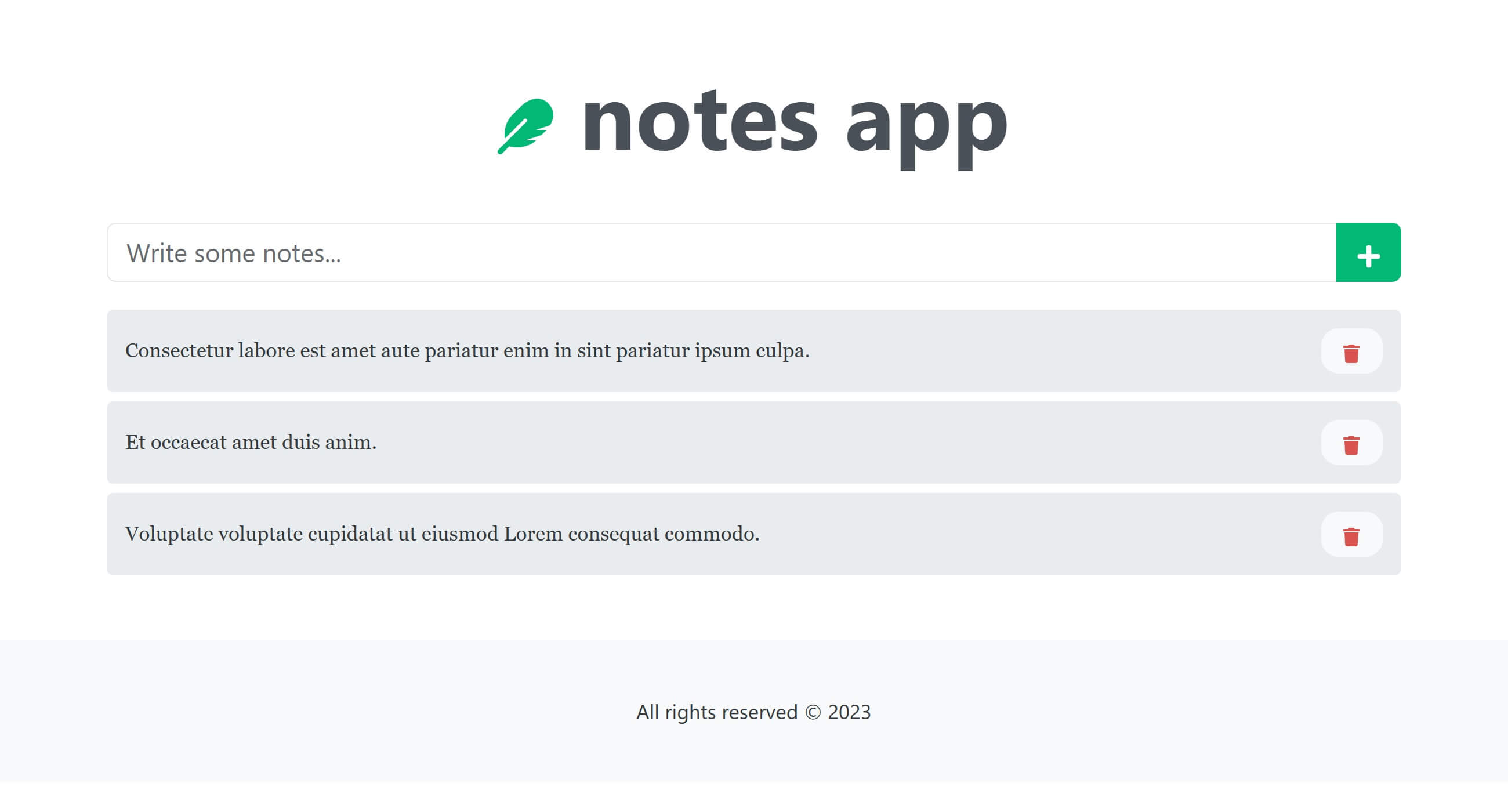
Looks pretty decent; and this is how our project structure is looking now:
notesy-app
|-- public
|   |-- vite.svg
|-- src
|   |-- assets
|   |   |-- react.svg
|   |-- components
|   |   |-- Empty.jsx
|   |   |-- Footer.jsx
|   |   |-- Form.jsx
|   |   |-- Header.jsx
|   |   |-- Item.jsx
|   |   |-- List.jsx
|   |-- App.jsx
|   |-- index.css
|   |-- main.jsx
|-- .eslintrc.cjs
|-- banner.png
|-- data.js
|-- index.html
|-- package.json
|-- README.md
|-- vite.config.js
In the GitHub repository, you can find project for this article in the directory called "react-1-init", the other folders are for the further milestone.


December 31, 2020

October 19, 2020

March 02, 2022
CodeOmelet is perfect for code hunger; its a coding blog containing articles and solutions related to web, mobile, cloud, console, desktop applications for the developers.

October 11, 2025

October 11, 2025
 .NET C#
 Angular
 Azure
Azure
 JavaScript
 JEST
JEST
 NodeJS